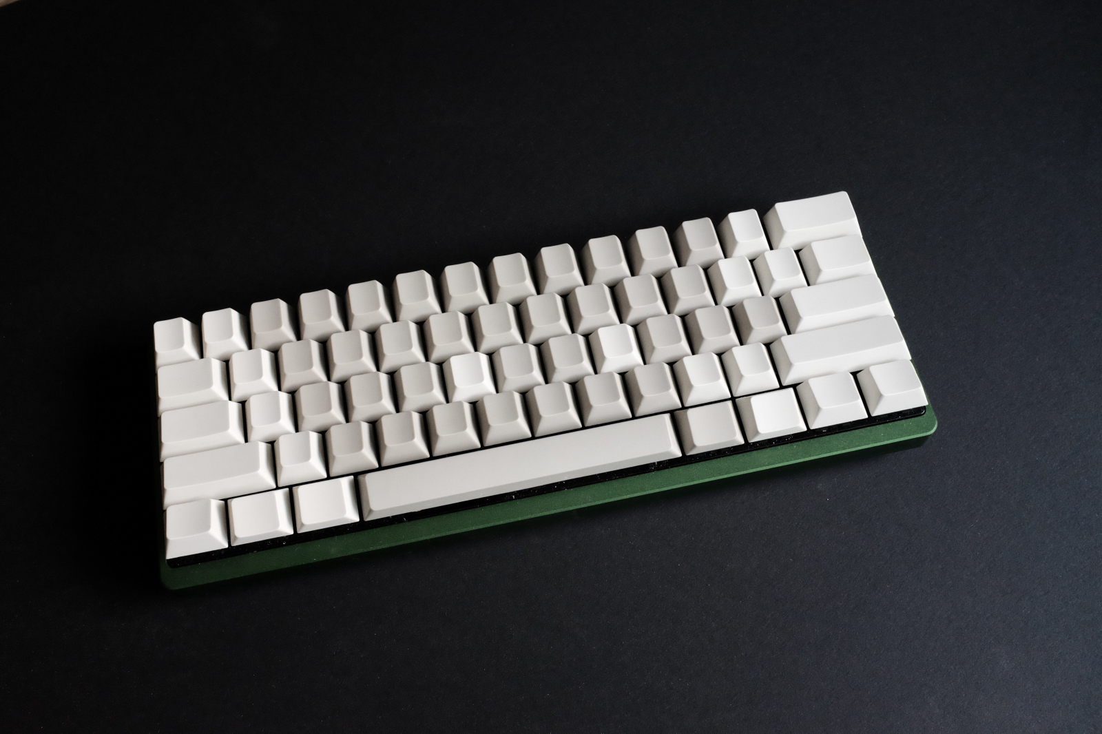
gateron pbt keycaps
seem like an unlikely topic. You have to be a somewhat of a “geek” to care about the subject. Most keyboards come with inexpensive ABS keycaps which are prone to wear over time—sometimes showing wear within months. PBT and POM plastics are more expensive to produce and are a much denser material which impart a more “solid” feel to the keyboard.
A recent “group buy” at Geekhack allowed me to sample PBT caps from another vendor, Gateron. My existing Poker 2 keyboard came with Vortex OEM profile PBT caps which I later replaced with a set of Vortex Cherry profile blank PBT’s.

The Gateron Cherry profile keycaps were available in four colours of which I purchased dark gray, light gray and beige—white being to bright for my tastes. The dark gray Gateron contrasted to the Vortex dark gray was much grayer to the Vortex’s near black colour. The light gray looked more like a dark beige, especially when matched with the beige set.
Waiting for the order to complete, whose process took two months from the announcement of the group buy, I originally planned to use three colours to create a layout with some visual cues for those key combinations that occasionally required a glance at the keyboard. I came up with this..
`~ = 1 2 3 4 5 6 7 8 9 0 [ ]
Esc - Q W F P B J L U Y ; ' Del
Tab / A R S T G M N E I O Enter
\ Shift X V D C Z K H , . Shift
Ctrl Win Alt Space Backspace Fn Pn Ctrl
Using three colours allowed delineating the alphanumeric, special character and modifier key regions of the keyboard but at the cost of being somewhat noisy, possibly due to the contrast of the dark gray keycaps with the other two colours—even with the dark gray Vortex, dark gray and light gray Gateron’s and the dark gray, light gray and beige Gateron color combinations.
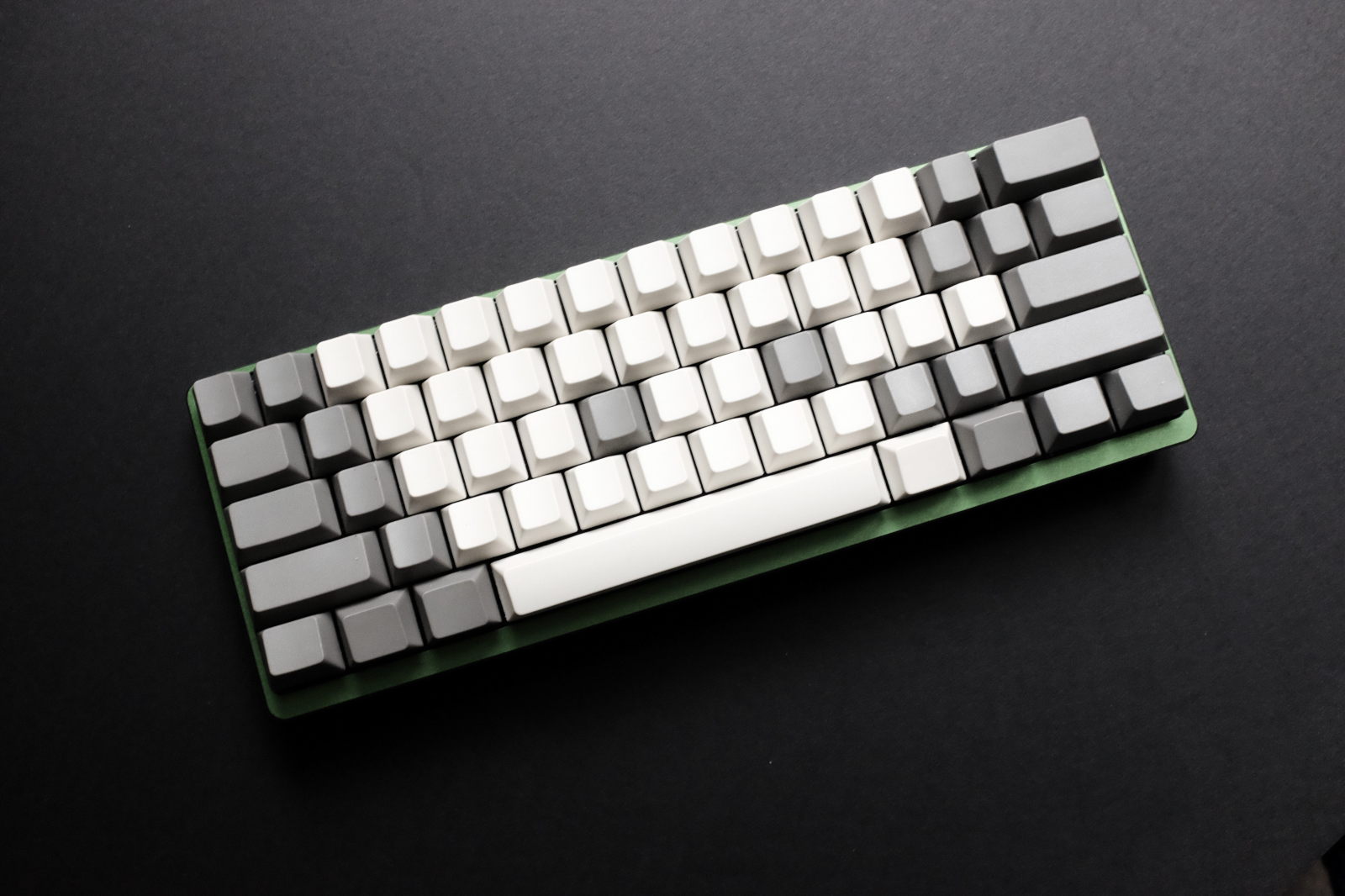
The symmetry of the Colemak Shift-DH layout, however, did lend itself to a two toned colour layout which was sufficiently informative but more aesthetically pleasing (pour moi). Using light gray (which looks like dark beige in contrast) for alphanumeric and beige for special character and modifier keys, creates a quiet two toned keyboard layout..
`~ = 1 2 3 4 5 6 7 8 9 0 [ ]
Esc - Q W F P B J L U Y ; ' Del
Tab / A R S T G M N E I O Enter
\ Shift X V D C Z K H , . Shift
Ctrl Win Alt Space Backspace Fn Pn Ctrl
Highlighting the index finger home row keys—versus using the common “raised” bar or scoop F and J keys—completed the layout with an additional visual reference point for adjacent keys, especially the right shifted number row. While the Backspace key colour is usually the same as the modifier keys in typical ANSI layouts, matching it to the Space bar as its counterpoint looked better, in this case, to separate it from the modifier keys of the bottom row.
After using the subdued combination of Gateron light grey and biege keycaps for several weeks, I reverted to trying the biege with dark grey keycaps for a high contrast layout. I left off the O-rings this time and, to my surprise, quite liked the new feel and sound—perhaps the result of focusing on developing a light touch with the Cherry Reds. Newness probably plays a lot into this but, for now, it’s a keeper combination.

The Gateron Cherry profile keycaps sit ever so slightly higher on their Cherry switches than the Vortex Cherry profile keycaps. But more importantly, their slightly fatter finger pads (tops) than the Vortex Cherry profile keycaps, feel even better in use.
My keyboard tweaking is done.. unless a rumoured set of Gateron Cherry profile jelly POM keycaps becomes available through yet another group buy! Like a good bed, investing in keyboard ergonomics pays dividends when you spend countless hours writing and coding.